Over the last couple of months, I've been sharing some of my top data visualization tips on Instagram. The principles have been written about a million times before, but it's oh so easy to slip up on the basics. Now that I've got to number 5, I decided to bring them together for your viewing pleasure.
If you have any suggestions on topics or have your own tips to share, please let me know and I'll try to work them into the series.
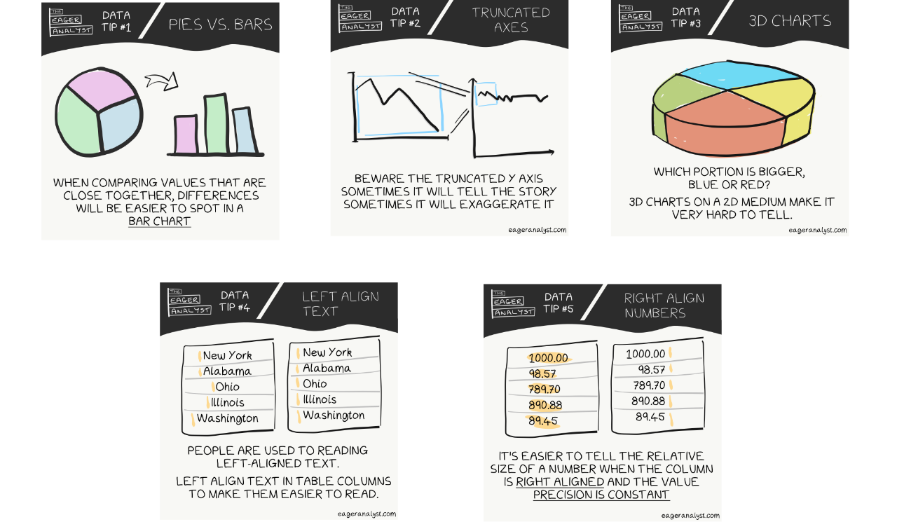
Pies vs Bars
When comparing values that are close together, differences will be easier to spot in a bar chart.
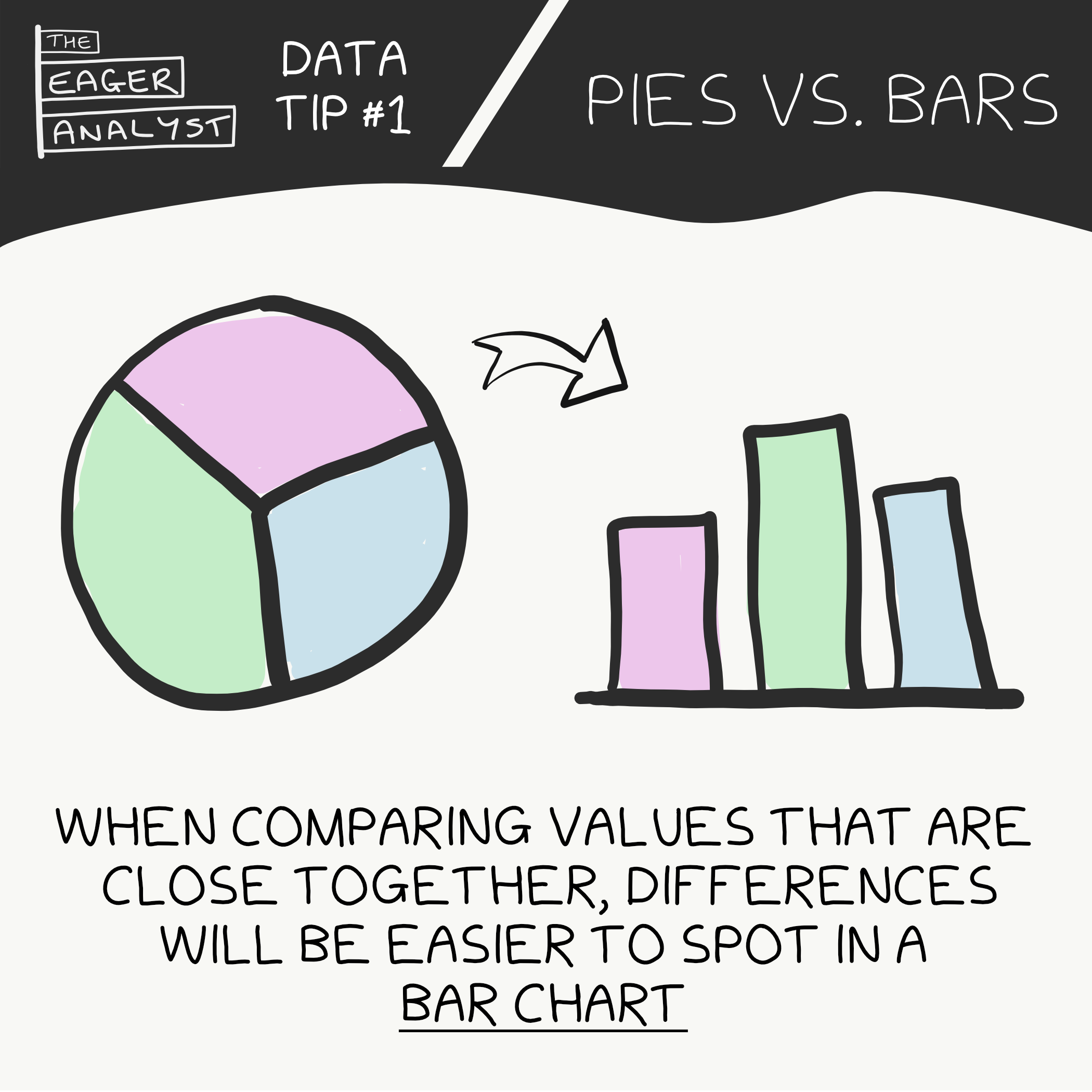
Truncated Axes
Beware the truncated y axis. Sometimes it will tell the story and sometimes it will exaggerate it.
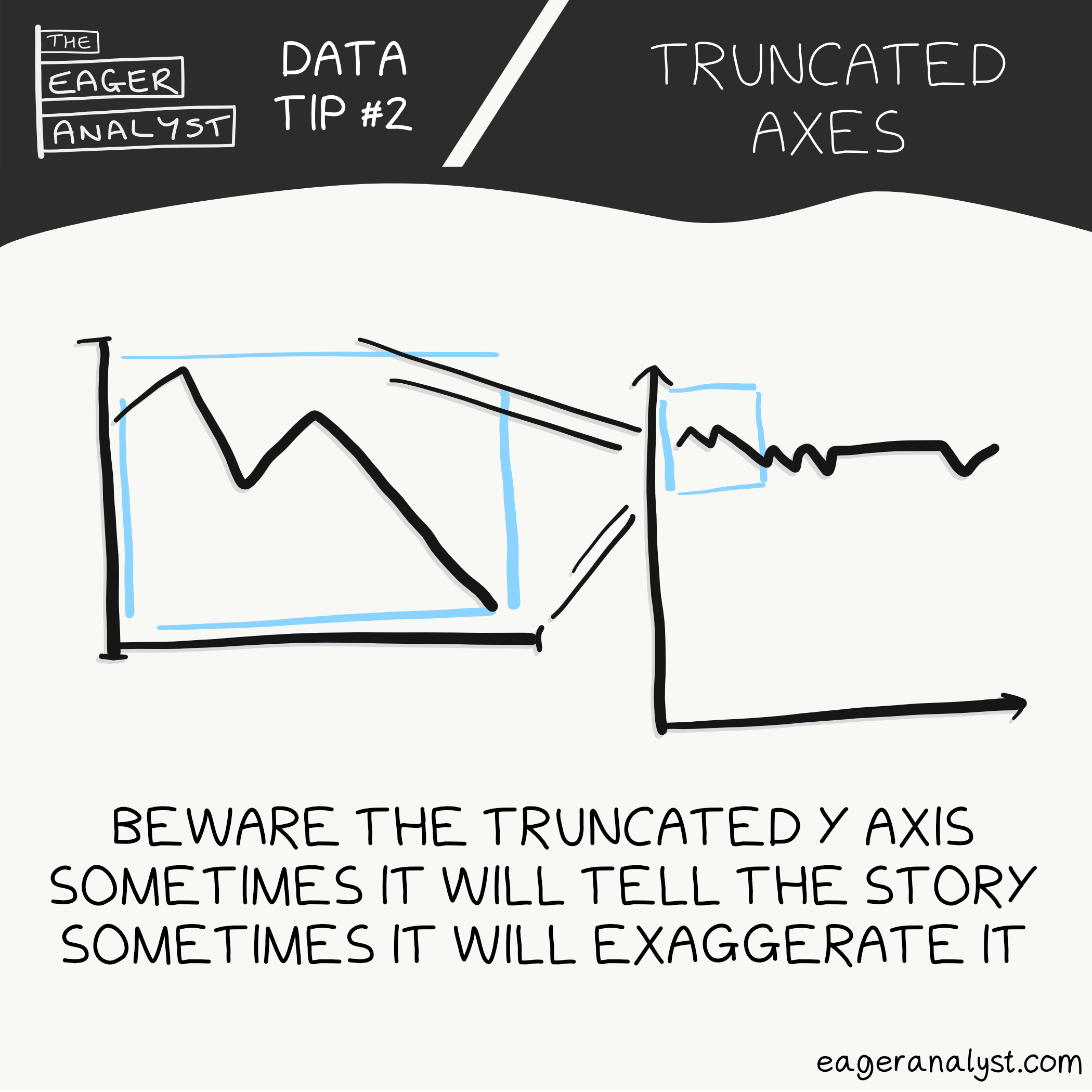
3D Charts
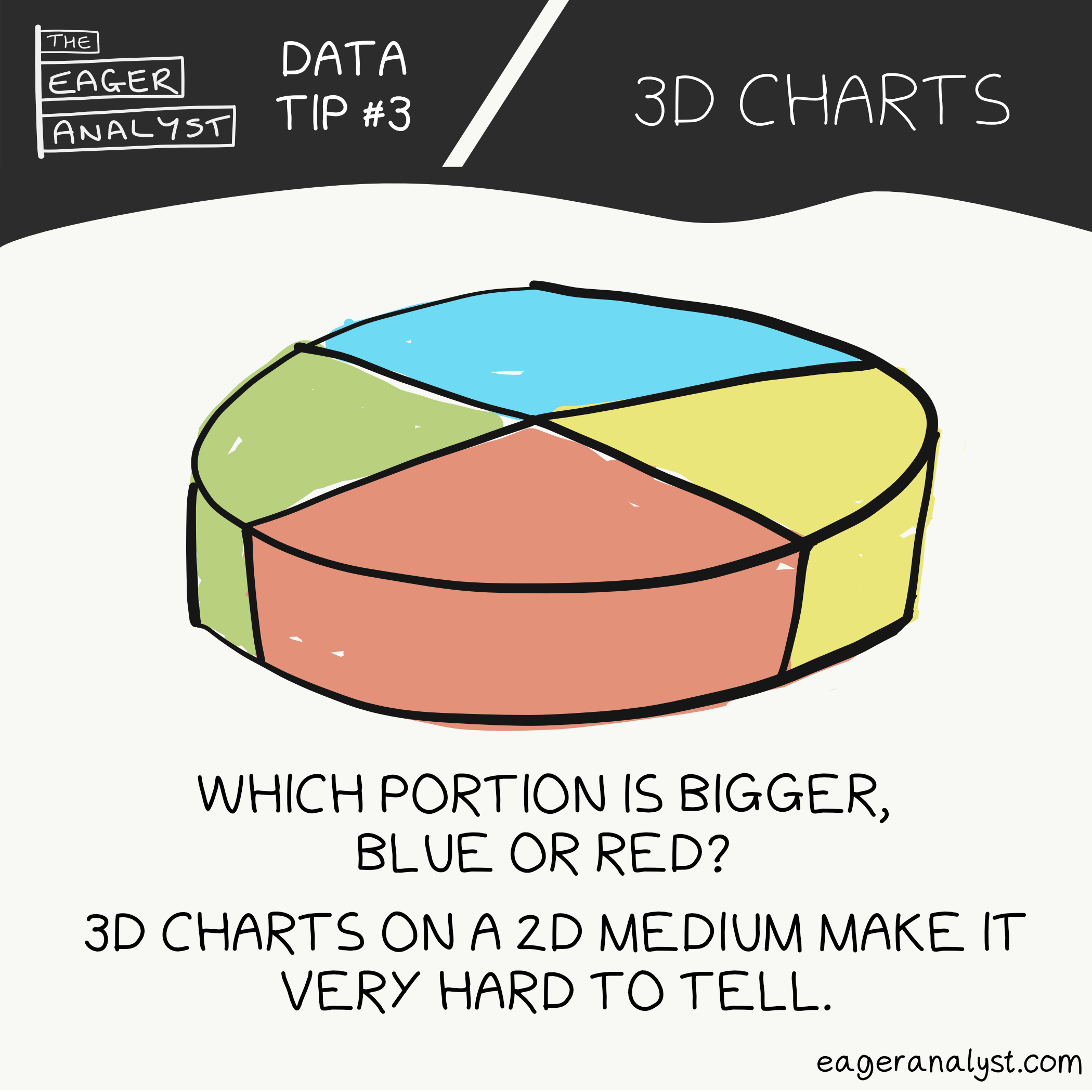
3D charts on a 2D medium make it very hard to tell the relative sizes of values accurately.
Left Align Text
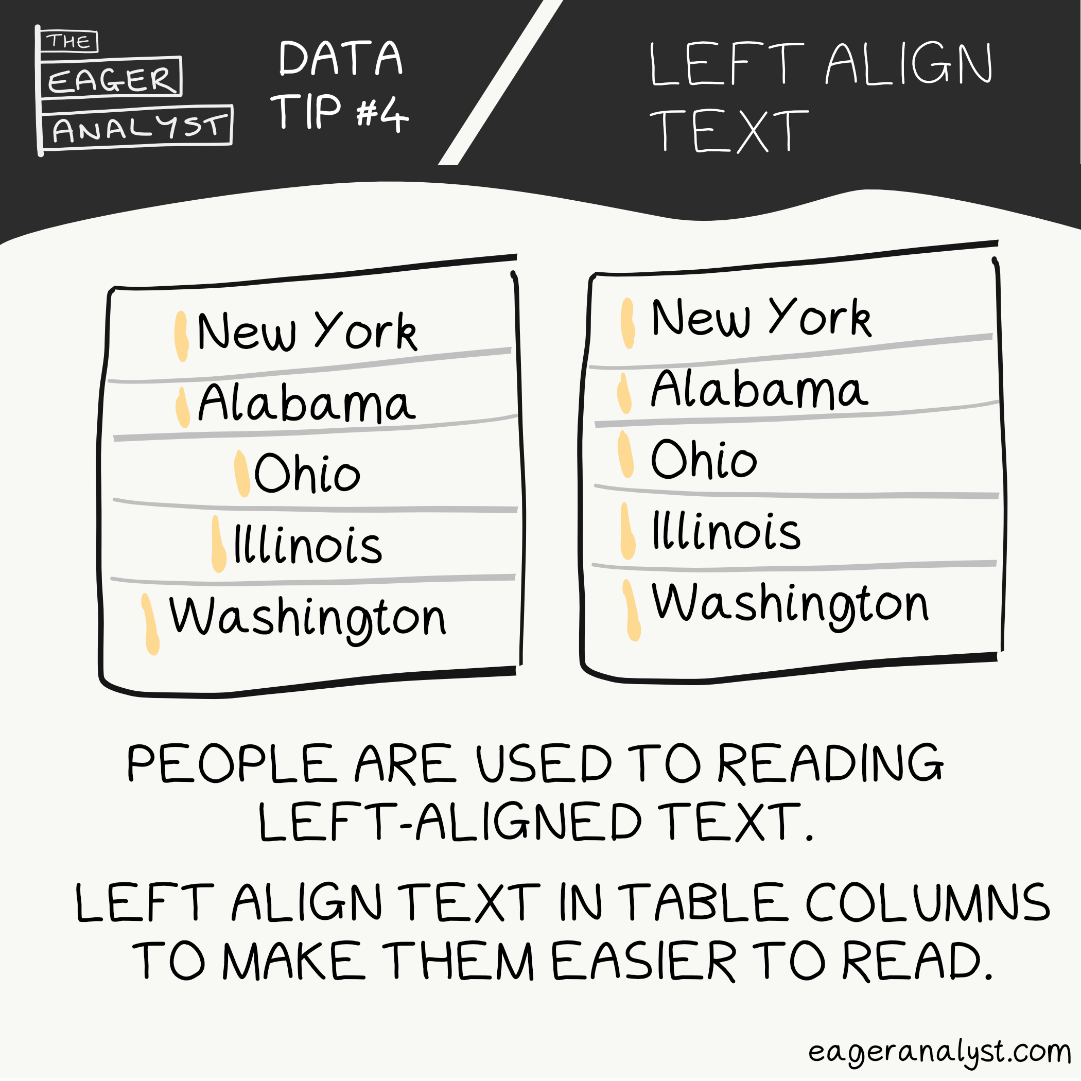
People are used to reading left-aligned text. Left align text in table columns to make them easier to read.
Right Align Numbers
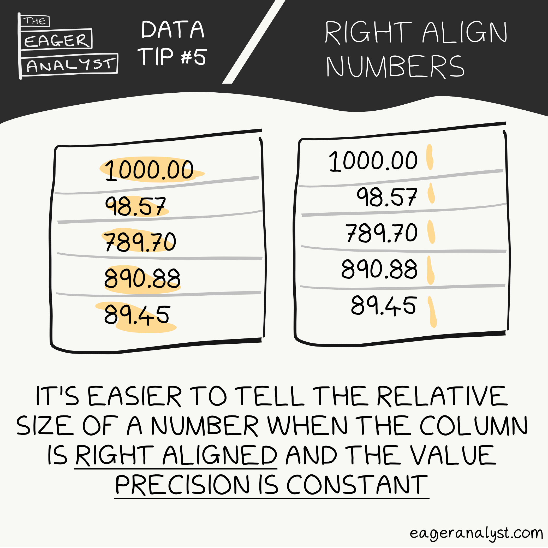
It's easier to tell the relative size of a number when the column is right aligned and the value precision is constant.